Overview_001
MediPal is a web and mobile app concept that lets users book appointments across multiple healthcare providers, track appointments in real time, check in contactlessly, and centralise their prescriptions and treatment records in one place. The project was designed for two distinct user types: busy active professionals managing multiple practitioners, and older users with ongoing health conditions managing frequent appointments manually. The design challenge was building a single, intuitive service that worked for both, reducing wait time friction, eliminating app fragmentation, and making healthcare management feel effortless rather than administrative.
8m 17s
Avg. Task Completion
Problem_002
Managing healthcare needs across multiple practitioners is fragmented and inefficient. Users juggle separate apps per clinic, sit in waiting rooms with no visibility on delays, manage prescriptions on paper, and manually track appointment times across personal calendars. Research confirmed three dominant pain points, all centred on time, convenience, and information being scattered across too many places.
Pain Point 01
Appointment wait times, 50% of survey respondents said live updates and tracking would most improve their experience attending appointments.
Pain Point 02
App fragmentation, active users had to manage a different booking app for every practitioner, with no unified view of upcoming appointments or treatments.
Pain Point 03
Treatment tracking, 20% had no tracking system at all; scripts were kept on paper, easily lost or damaged, with no reminders to renew or action medications.
Research_003
Research combined qualitative interviews (7 participants over 1 week) with a quantitative survey (40 respondents) to understand how people manage their healthcare needs, the considerations they make when choosing and booking practitioners, and how they track treatments and medications. Two distinct user segments emerged, App/Service Users (24–44, high digital confidence, frustrated by fragmentation) and Non-App/Service Users (55–65, lower digital confidence, open to adoption if sufficiently intuitive).
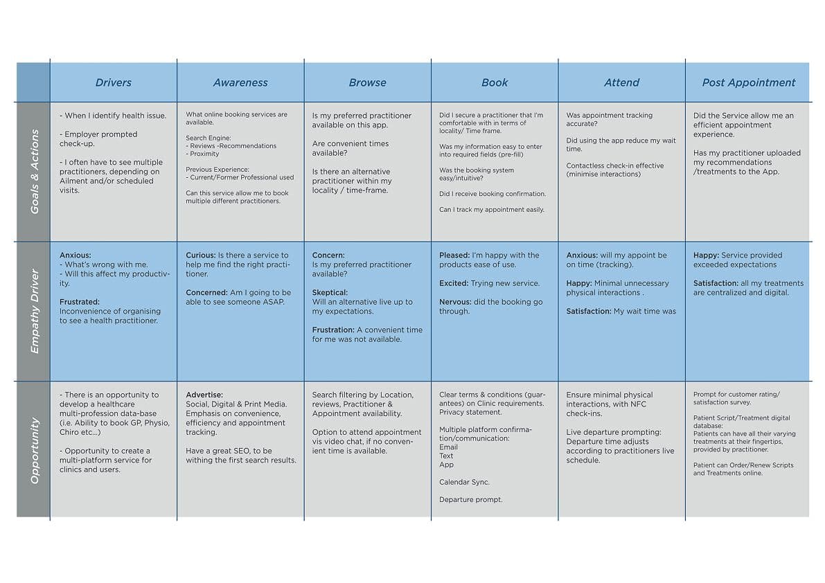
Customer journey map · Awareness → Browse → Book → Attend → Post-appointment
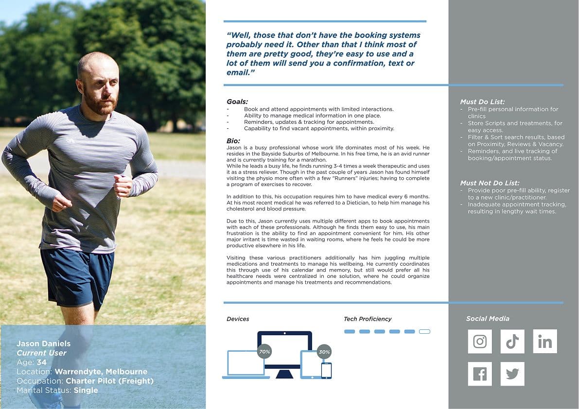
Jason Daniels
Current App/Service User · Age 34 · Warrandyte
Charter pilot with a busy lifestyle managing GP, Physio, and Dietician appointments across multiple apps. Frustrated by appointment availability, waiting room time, and having to re-enter personal information for each new clinic. Values pre-fill, live tracking, and minimal physical interactions above all.
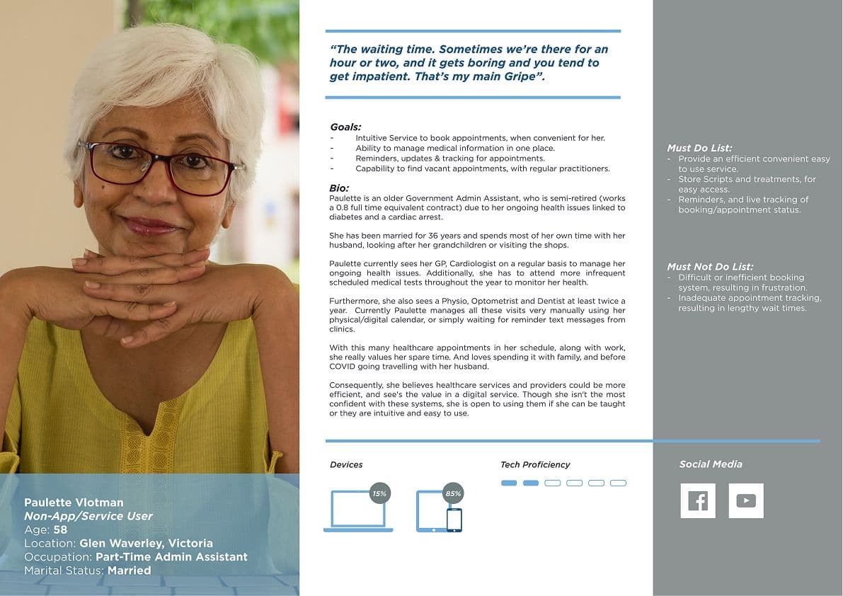
Paulette Vlotman
Non-App/Service User · Age 58 · Glen Waverley
Part-time admin assistant managing ongoing health conditions (diabetes, cardiac) with frequent visits to GP, Cardiologist, Physio, Optometrist, and Dentist. Currently manages all appointments manually via calendar and paper scripts. Open to digital if intuitive, waiting time is her primary frustration.
“"The waiting time. Sometimes we're there for an hour or two, and it gets boring and you tend to get impatient. That's my main Gripe."”
Paulette Vlotman · Non-App/Service User Persona
Process_004
The process moved from qualitative and quantitative research through IA definition, user flow mapping, annotated wireframing, Axure prototype build, and moderated usability testing, with testing findings driving the most significant structural refinements. The 8-screen site map and three core user flows (Login/Register, Book Appointment, Track Booking) formed the backbone of the prototype.
01
Information Architecture
Defined a 7-level app hierarchy, Splash, Onboarding, Register/Login, Dashboard, Appointments, Treatments, Search, Account, based on research pain points. Entity/attribute breakdown documented every screen, sub-entity, and field across the full app.
02
User Flow Mapping
Three core flows mapped in Miro, Login/Register, Book Appointment (dual pathway: search by location or practitioner name), and Track Booking/Appointment Schedule. Flows validated the IA logic before a single wireframe was drawn.
03
Annotated Wireframes & Prototype
15 annotated wireframe screens built in Axure covering every primary flow, Splash, Onboarding, Dashboard, Search, Clinic/Practitioner profiles, Booking, Appointment info, Live Update, Treatments, and Account. Interaction logic documented per element.
04
Usability Testing (n=4)
Four participants completed scripted tasks averaging 8m 17s, Login/Register, Search by location and practitioner, Book appointment, Exit to OS, and respond to a live update notification. Task 4 (live update/notifications) generated the most errors and required the most facilitator prompting.
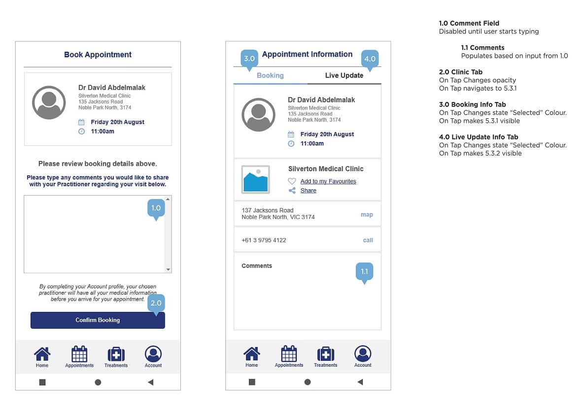
Annotated wireframes · Axure prototype, Dashboard, Search, Book Appointment, Live Update
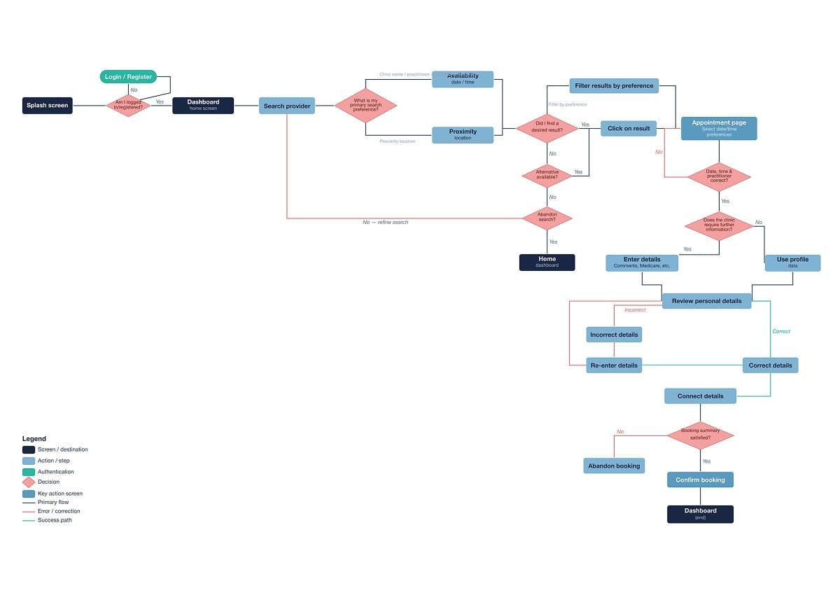
User flow · Book Appointment, dual pathway by location or practitioner
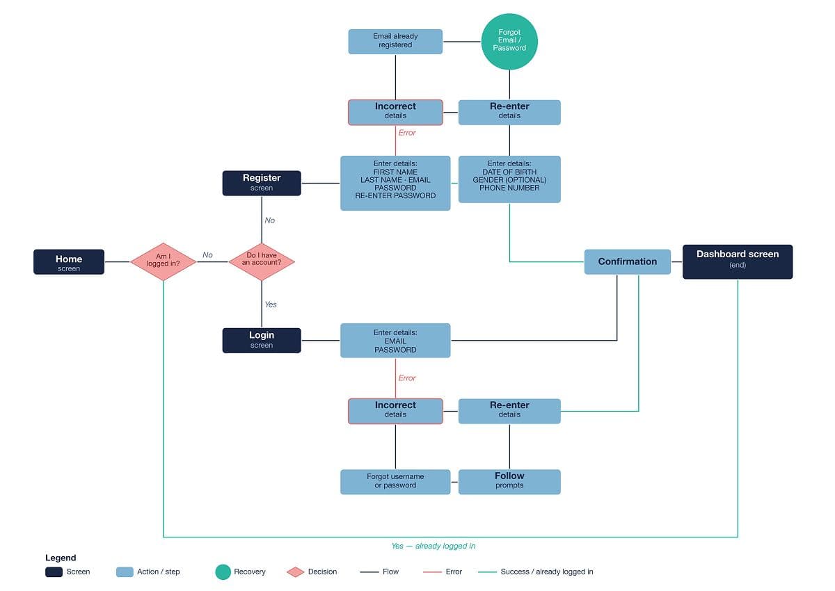
User flow · Login/Register and Track Booking/Appointment Schedule
Solution_005
MediPal brings appointment booking, real-time tracking, contactless check-in, and treatment management into a single intuitive app, designed around the mental models of both high-frequency digital users and lower-confidence adopters. The core IA decision was a tab-based navigation (Home, Appointments, Treatments, Account) that mirrors familiar e-commerce app patterns, reducing the learning curve for new users.
Search & Book
Search by provider/clinic name, speciality, or suburb/postcode. Filter by date, time, and availability. Dual booking pathway, existing or new patient, with pre-filled personal information reducing form friction at every clinic.
Real-Time Tracking
Live departure prompts adjust in real time based on the practitioner's running schedule. Users are notified if their appointment is running late and given an updated departure time, minimising waiting room time.
Contactless Check-In
NFC-based check-in notifies the clinic of arrival with minimal physical interactions. Video and phone consultation options available when no convenient in-person time is available.
Treatment & Script Wallet
Current and historical scripts and treatments stored digitally, accessible at any time. Treatment reminders, medication frequency tracking, and online renewal/repurchase, all in one place.
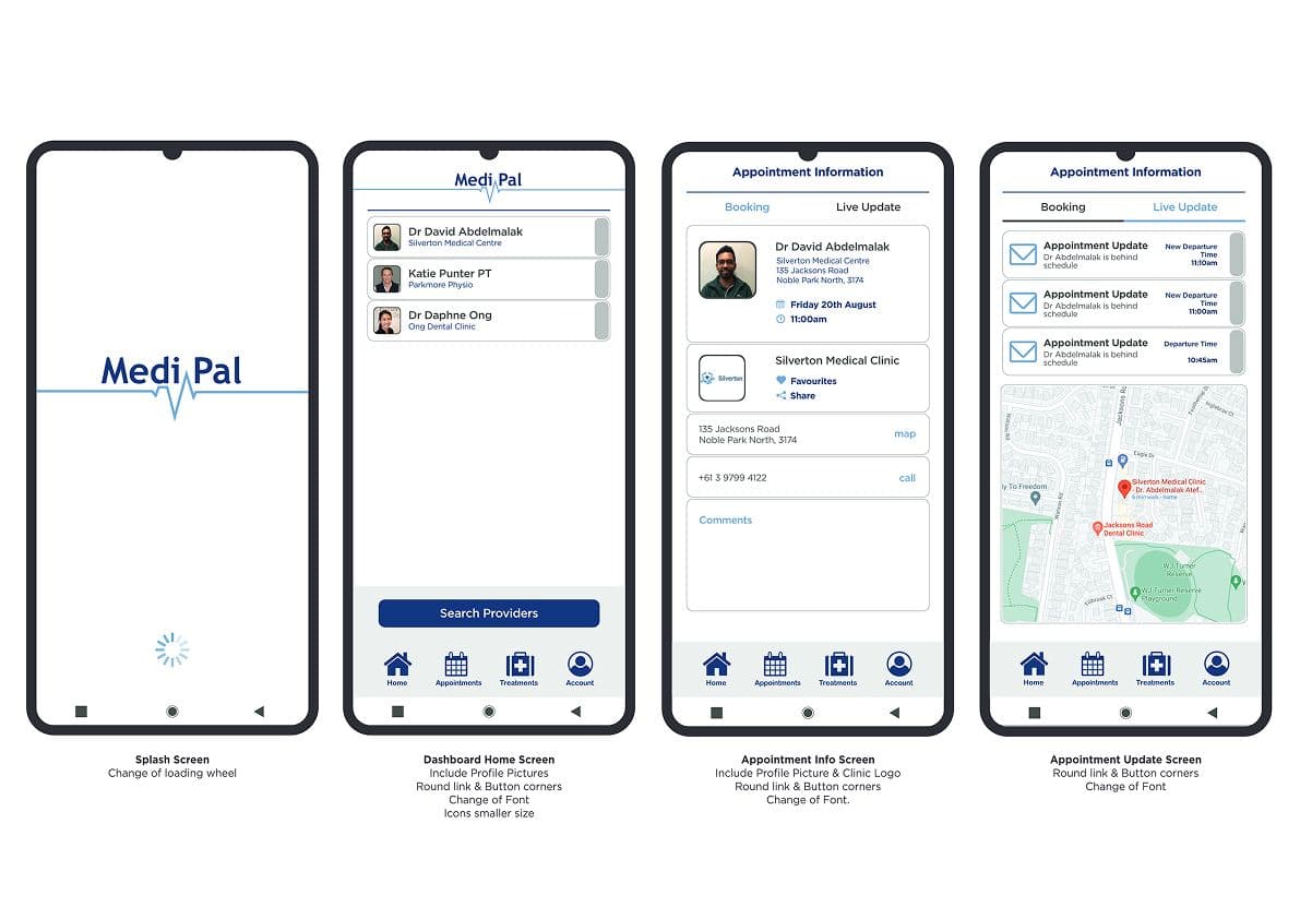
High-fidelity screens · Splash, Dashboard, Search, Appointment Info, Live Update
Walkthrough of Medipal prototype built for user testing
Outcomes_006
Usability testing confirmed the app had a familiar, functional format, all participants completed tasks in an average of 8m 17s and expressed strong overall satisfaction. The notification/live update flow was identified as the primary area for improvement, 50% of participants required prompting to access notifications, and no participant intuitively accessed the appointment info tab after reviewing their departure time update. All four participants said they would use MediPal again.
Key Outcome
A fully tested Axure prototype across 15 screens and 3 core flows, with 100% task completion on Login, Search, and Booking, and clear, actionable findings on notification UX to drive the next iteration.
Reflection_007
The research surfaced a meaningful split between user segments, active digital users frustrated by fragmentation, and older users who were open to digital but needed an exceptionally intuitive interface. This tension shaped every IA decision toward simplicity and step-by-step flows over feature density. The usability test was most valuable in exposing the notification/live update flow as counterintuitive, users focused entirely on the departure time and ignored the appointment info tab, suggesting the two pieces of information need to be surfaced together on a single screen rather than requiring navigation. If I were to run another sprint, I'd conduct a card sorting study to harden the IA hierarchy, and redesign the live update screen to surface both departure time and appointment detail in a single view.
