Overview_001
The Officeworks Homepage carries a wide range of responsibilities, brand storytelling, promotions, navigation, and personalisation for very different customer intents. Over a multi-year program (2024–2026), the challenge was improving clarity and relevance (what is the primary purpose of the Hompage fro the Business vs. Customer?) at scale without breaking the high-impact, high-risk surface that the Homepage represents. The work evolved from isolated component optimisation toward a coordinated operating model, shifting the team from "what to say" toward "how customers orient and decide" at the start of their visit.
Problem_002
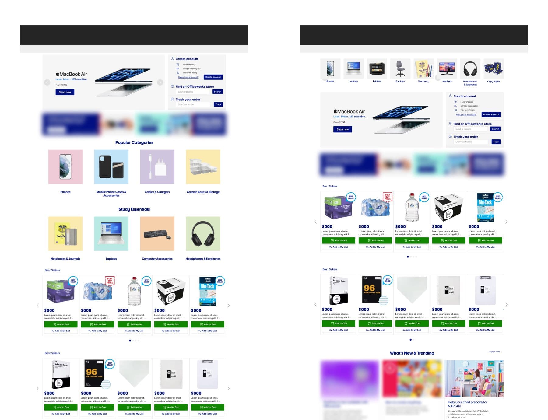
Customers often by passed the content to emabrk on a 'Product Search' journey, often struggling to identify with what content was relevant to them, or how the Homepage related to their task. Unclear messaging hierarchy, over-reliance on promotional carousels, low-engagement regions, and limited contextual guidance were compounded by stakeholder and ops friction that slowed iteration. Small changes risked large downstream effects, making the Homepage both high-impact and high-risk to optimise.
Pain Point 01
Customers scan the Homepage quickly and make early decisions based on clarity, not persuasion. Promotional overload reduced confidence and slowed decision-making rather than driving it.
Pain Point 02
Content cannibalisation, repeating the same trade story across multiple placements (hero + recommendations + bento) diluted the incremental value of each zone.
Pain Point 03
Mobile fragility, long copy and tall imagery consistently pushed primary CTAs below the fold on small screens, creating a device-specific experience that couldn't be ignored.
Research_003
Research combined a heuristic teardown, 2-year CRO journey mapping, behavioural analysis, customer feedback, and competitor benchmarking. Structured around A/B tests covering categories, hero design, recommendations simplification, value/benefit blocks, and targeted/seasonal content.
Each test charter included clear hypotheses and success criteria. The goal was to identify the most and least effective Homepage blocks and clarify the page's primary role in customer discovery.
Category tiles redesign · shipped to production
Process_004
The program ran as an iterative learning loop, reserach/Insights → test charter → A/B test → learn → iterate, across four phases over 2024–2026. Rather than a single redesign, each phase built on the last, with insights consolidated into design rules that informed Homepage decisions beyond individual experiments.
01
Establishing Baselines
Early tests focused on hero messaging, promotional emphasis, and value propositions. Results showed that stronger copy or visual treatment alone did not materially change behaviour if overall structure remained complex, framing the shift toward hierarchy and orientation.
02
Hierarchy & Orientation
Subsequent experiments simplified the hero, clarified category entry points, and adjusted the balance between promotions and navigation. These changes improved engagement signals and reduced early drop-off, confirming that orientation mattered more than persuasion.
03
Personalisation & Relevance
Later tests introduced contextual and audience-based variations. Personalisation performed best when it removed irrelevant content or highlighted likely next steps, not when it attempted to surprise or upsell. Cannibalisation risk between themed recommendations and the hero was confirmed and codified.
04
Synthesis & Scale
Rather than continuously testing surface-level changes, insights were consolidated into design rules, a one-job-per-zone operating model, mobile-first constraints, curation guardrails, and lightweight governance, that informed Homepage decisions across the team.
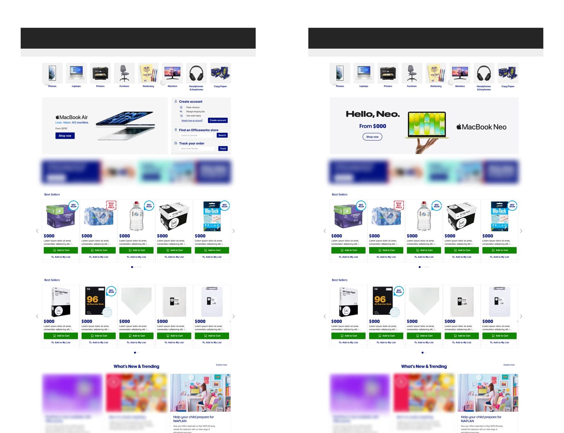
Full-width hero · double-digit lift · shipped to production
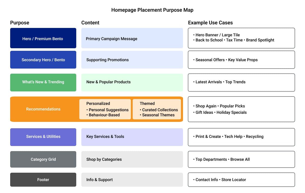
Placement Purpose Map · One job per zone, Wayfinding / Trade / Discovery / Supplier
Mobile-first constraints · Copy limits, image ratios, CTA visibility thresholds
Solution_005
The final solution is not a single screen, it's a coordinated operating model that prevents the Homepage competing with itself. A one-job-per-zone (placement purpose map) framework, mobile-first constraints, curation guardrails, and lightweight governance work together to protect compounding effects and keep daily operations flexible.
One Job Per Zone
Wayfinding (categories/navigation) always present and prominent. Trade (hero/premium) owns the primary campaign moment, no theme duplication downstream. Discovery (recommendations) adds distinct value only. Supplier (Bento) is governed premium real estate with creative standards.
Mobile-First Constraints
Non-negotiable copy length, image ratio rules, and CTA visibility thresholds that preserve core actions on small screens. Device-specific treatments for carousels and grids. Applied across all card-based modules, no exceptions.
Curation Rules
Complement the hero, attach/adjacent categories, brand spotlights, price-led hot drops. Never repeat the same trade story in Discovery zones. A theme should not appear in multiple modules unless architecturally intentional.
Governance & RACI
Zone eligibility and duplication rules, mobile-readiness checks, SKU strength checks, and clear approvals, co-created with the eComm content lead. Keeps daily operations flexible while protecting clarity and compounding performance effects.
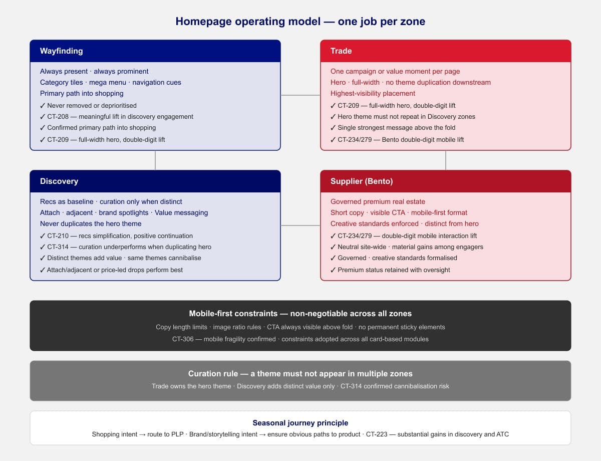
Homepage operating model · One-job-per-zone framework with mobile-first constraints
Categories / Tiles (Wayfinding)
Elevating categories and improving tile scannability will strengthen discovery paths into shopping.
Meaningful ↑
Discovery engagement · Shipped ⭐
Hero Full-Width (Clarity)
A full-width, decluttered hero will improve above-the-fold clarity and primary message engagement.
Double-digit ↑
Hero interaction · Shipped ⭐
Recommendations Simplification
Reducing rec density will lower cognitive load and improve continuation where strongest logic is retained.
Low single-digit ↑
Continuation · Kept
Manually curated themes will outperform algorithmic baseline by adding relevant discovery value.
Underperformed
Cannibalisation confirmed · Rules added
Seasonal Journey (Mother's Day)
Routing seasonal clicks to a shop-ready PLP will drive stronger product discovery than a campaign splash page.
Substantial ↑
Discovery & ATC · Adopted situationally
Search-Term Pills (Intent Strip)
Surfacing popular search terms will reduce friction and accelerate qualified search behaviour.
Neutral
High engagement, neutral commercial · Not always-on
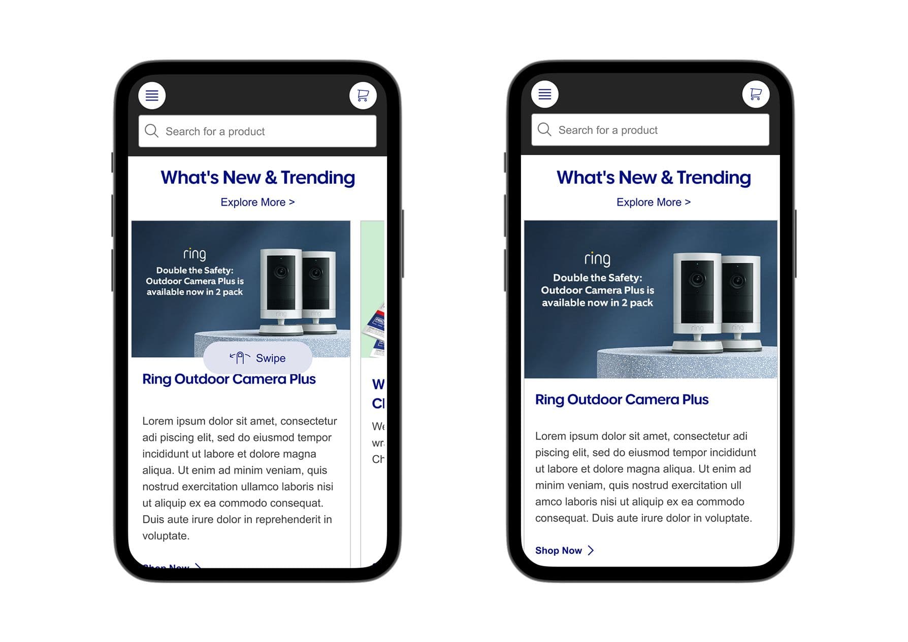
New & Trending Mobile Card
Mobile-first card formats will improve engagement in low-performing regions.
Constraints adopted
Mobile fragility confirmed · Rules shipped
A modular premium surface with short copy and visible CTAs will increase top-of-page engagement on mobile.
Double-digit ↑
Mobile interaction · Retained, governed
Outcomes_006
The program moved from isolated component lifts to coordinated orchestration, reducing competition between Homepage blocks and protecting compounding effects. The one-job-per-zone operating model was adopted across the team. All outcomes are directional, no commercially sensitive metrics are published.
Key Outcome
Three variants shipped to production across the program, Category tiles, Full-width Hero), and Bento, with a coordinated one-job-per-zone operating model adopted by the team to compound gains over time.
Reflection_007
What changed the game wasn't a single big win, it was coordinating how placements work together. The shift to a one-job-per-zone model, combined with mobile-first guardrails and simple governance, turned sporadic lifts into compounding improvements. It also created a shared language with eComm/Trade, so the team can keep shipping a purposeful homepage under real operational constraints. If I were to do it again, I'd push for the governance framework earlier, the biggest delays came from content decisions that competed with tested patterns, and a clearer RACI from the start would have protected more of the gains.
