Overview_001
The Officeworks Checkout is a shared web/app surface handling a wide range of customer types, guest, logged-in, loyalty members and B2B, across desktop and mobile. The optimisation program aimed to reduce friction and shorten the perceived journey without touching payment mechanics or back-end platform logic. Three parallel streams ran across 2024–2025, guest/login UI, Cart Review progression, and mobile CTA visibility, each structured as iterate-to-success experiments with clear hypotheses and guardrail metrics.
Problem_002
Customers experienced a confusing, hard to navigate checkout with friction editing the cart once inside. Delivery costs and availability appeared too late, loyalty and discount placement was unclear, and some UI patterns competed with the primary progression path (Including product attachement and charity donation widgets). Platform constraints, how availability is populated after address entry, brittle payment step behaviours, limited what could be solved through front-end tests alone.
Pain Point 01
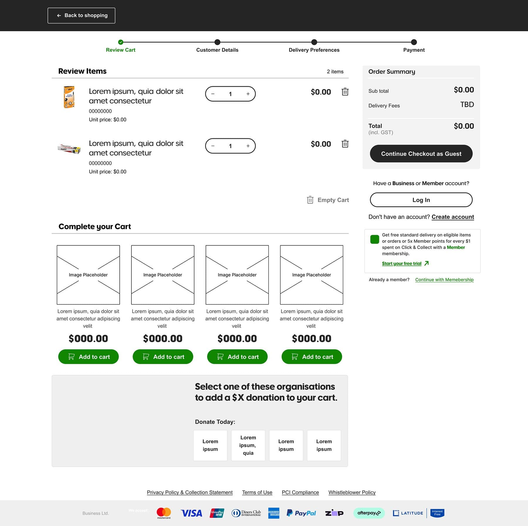
Cart editing friction, once inside checkout, customers found it difficult to modify their cart, creating confusion and abandonment at a high-value moment in the journey.
Pain Point 02
Late delivery transparency, costs and availability surfacing too late in the flow created frustration and trust issues at the point of commitment.
Pain Point 03
Mobile CTA visibility, primary Continue actions were consistently pushed below the fold on small screens by competing UI elements, creating a device-specific drop-off problem.
Research_003
Research combined customer feedback (NPS and internal notes), heuristic teardown, competitor analysis of checkout flows (guest-first affordance, fewer fields, early delivery transparency, progress indicators, express pay, sticky order summaries), and a FY25 Checkout experimentation plan. Four design principles framed the work: shorten the perceived journey, respect intent (guest-first by default), optimise for device realities, and operate within the existing stack.
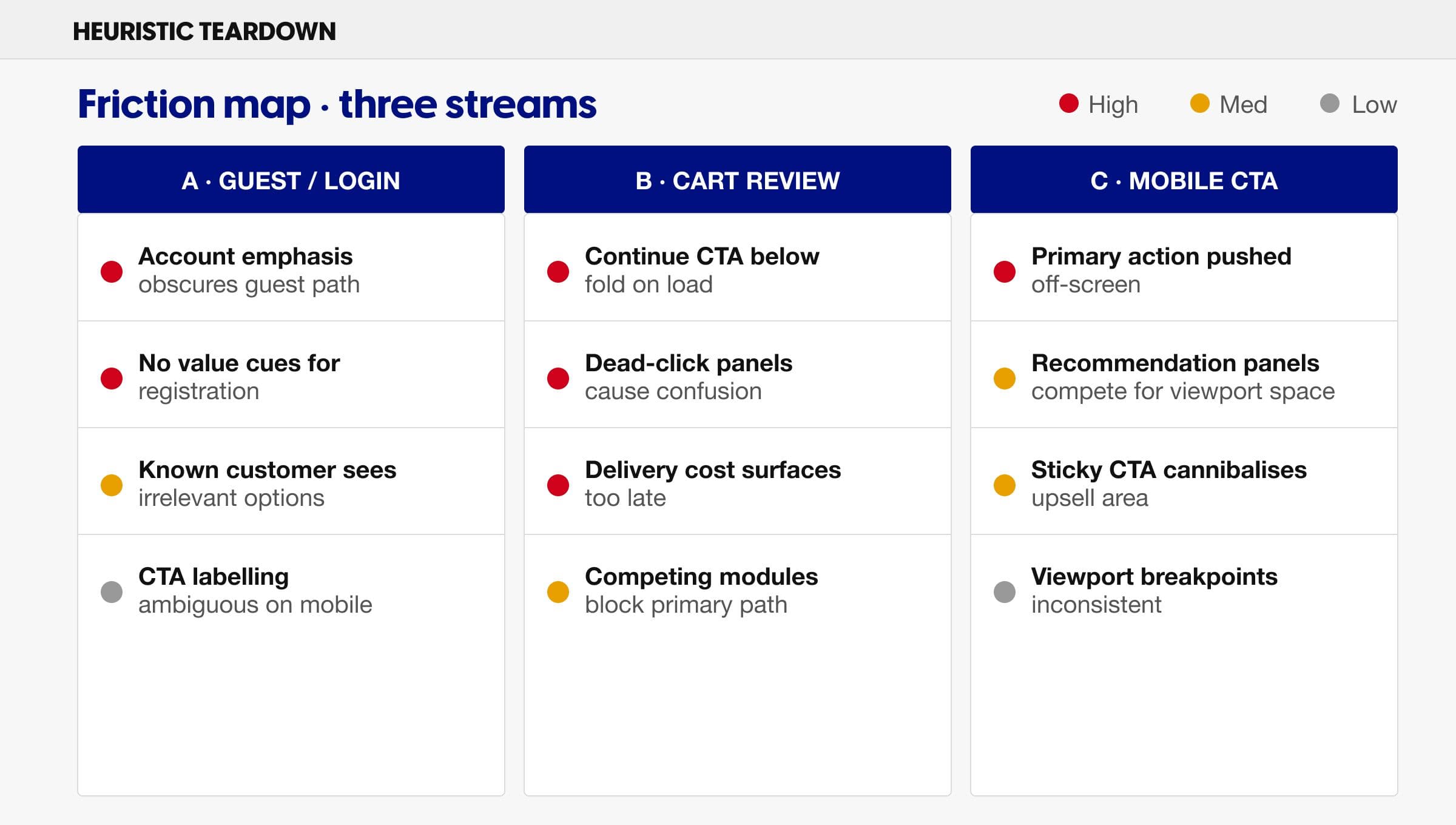
Heuristic teardown · Checkout friction mapping across guest/login, cart review, and mobile CTA streams
Process_004
The program ran across four phases, framing, experiments and iteration, shipping, and knowledge transfer, with three parallel streams each following an iterate-to-success model. Each A/B test included clear hypotheses, targeting, and primary/guardrail metrics. One variant shipped; the program was paused mid-2025 with all insights consolidated into design rules for future enabling work.
01
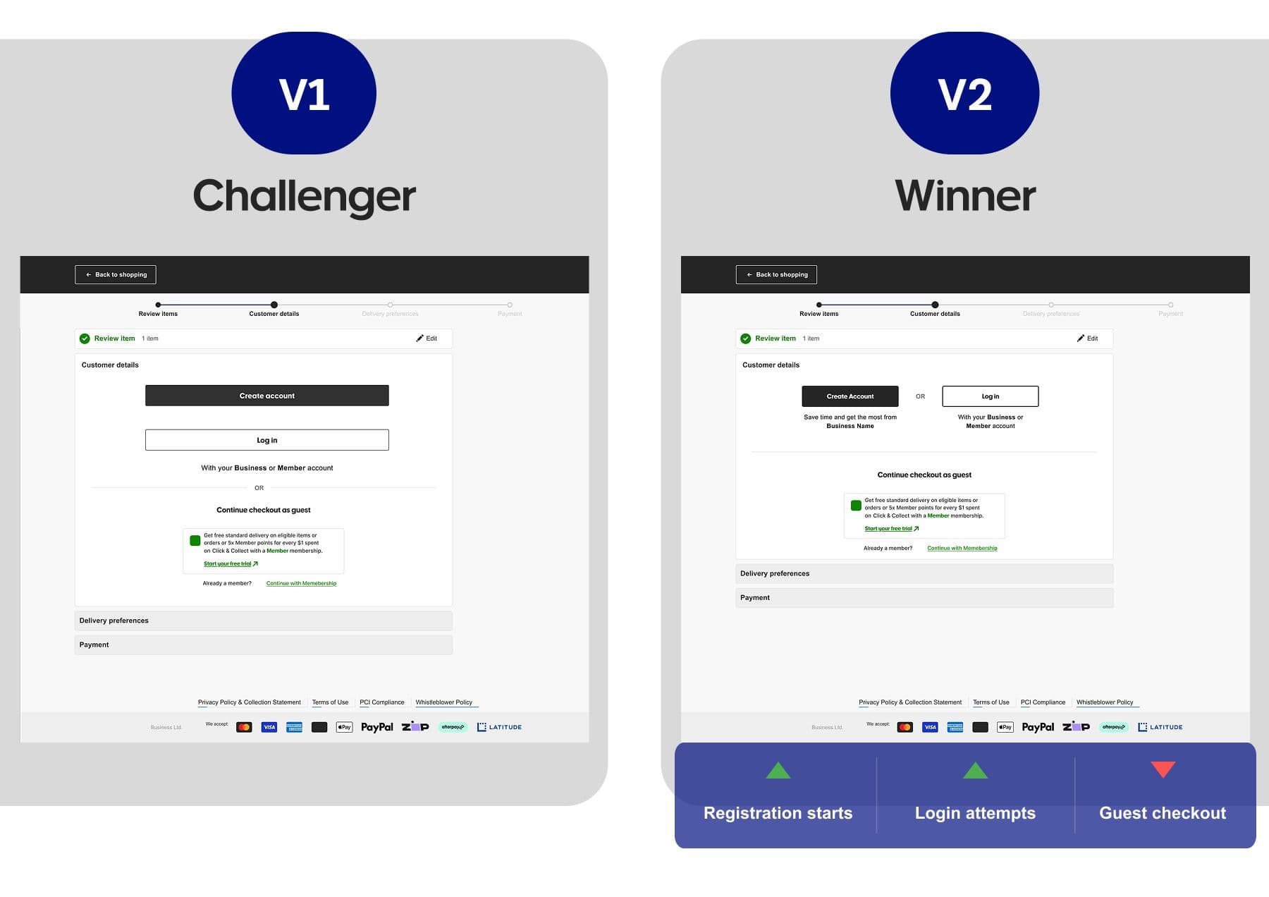
Stream A, Guest/Login UI
First attempt emphasised account/login within Customer Details, continuation was neutral but acquisition intent dipped. An iteration introduced side-by-side CTAs with value cues, improving login/registration intent while keeping continuation neutral. A targeted variant for recently-known customers removed irrelevant options. Desktop stacked CTA layout shipped to production.
02
Stream B, Cart Review → Continue
First pass raised the primary Continue CTA above the fold, neutral/negative site-wide due to a large logged-in cohort preferring familiar affordance. Iteration restored familiar cues while maintaining prominence; behavioural signals moved in the right direction. Heatmaps confirmed dead-click friction on non-interactive panels; simplification concept established a single obvious CTA pattern.
03
Stream C, Mobile CTA Visibility
A sticky Continue CTA improved visibility but competed with high-value recommendation placements on small screens, neutral-to-negative continuation and a material drop in add-on behaviour. Not commercially viable in tested form. Recommendation: contextual or paged alternatives that preserve upsell value.
04
Knowledge Transfer
Programme paused mid-2025 due to technical blockers, stakeholder constraints, and a platform change that prevented live testing. Findings consolidated into design rules and operating guardrails for stakeholders, ready to reuse when enabling work unblocks deeper changes.
Three parallel experiment streams · Guest/Login · Cart Review · Mobile CTA · 2024–2025
Stream A · Guest/Login UI — initial account emphasis vs side-by-side CTAs with value cues
Stream B · Cart Review — above-the-fold Continue vs prominence-with-familiarity
Solution_005
The solution is a set of design patterns and guardrails, not a single shipped screen. One desktop customer-details variant is live in production; the remaining patterns were documented as design rules ready to scale when platform enabling work lands.
Guest-First with Value-Cued Login
Keep guest checkout obvious. Side-by-side CTAs with succinct value proof when prompting for account/login. For recently-known customers, suppress irrelevant options to reduce choice friction. ~30% relative uplift in registration starts.
Cart Review Clarity
Familiar, obvious Continue affordance for logged-in customers. Reduce below-the-fold dependency. Retire dead-click panels that look interactive but aren't. Avoid stacking competing modules above the primary path at the moment of progression.
Mobile Rules
Ensure visibility of the primary action without permanently crowding the viewport or cannibalising upsell areas. Prefer contextual or progressive patterns over permanent sticky elements, confirmed by CT-288 decline.
Scope Guardrails
Focus optimisation where the team can ship sustainably, UI, sequencing, copy, validation, trust signals. Defer back-end-heavy ideas (delivery transparency, availability logic) until enabling platform work makes them low-risk.
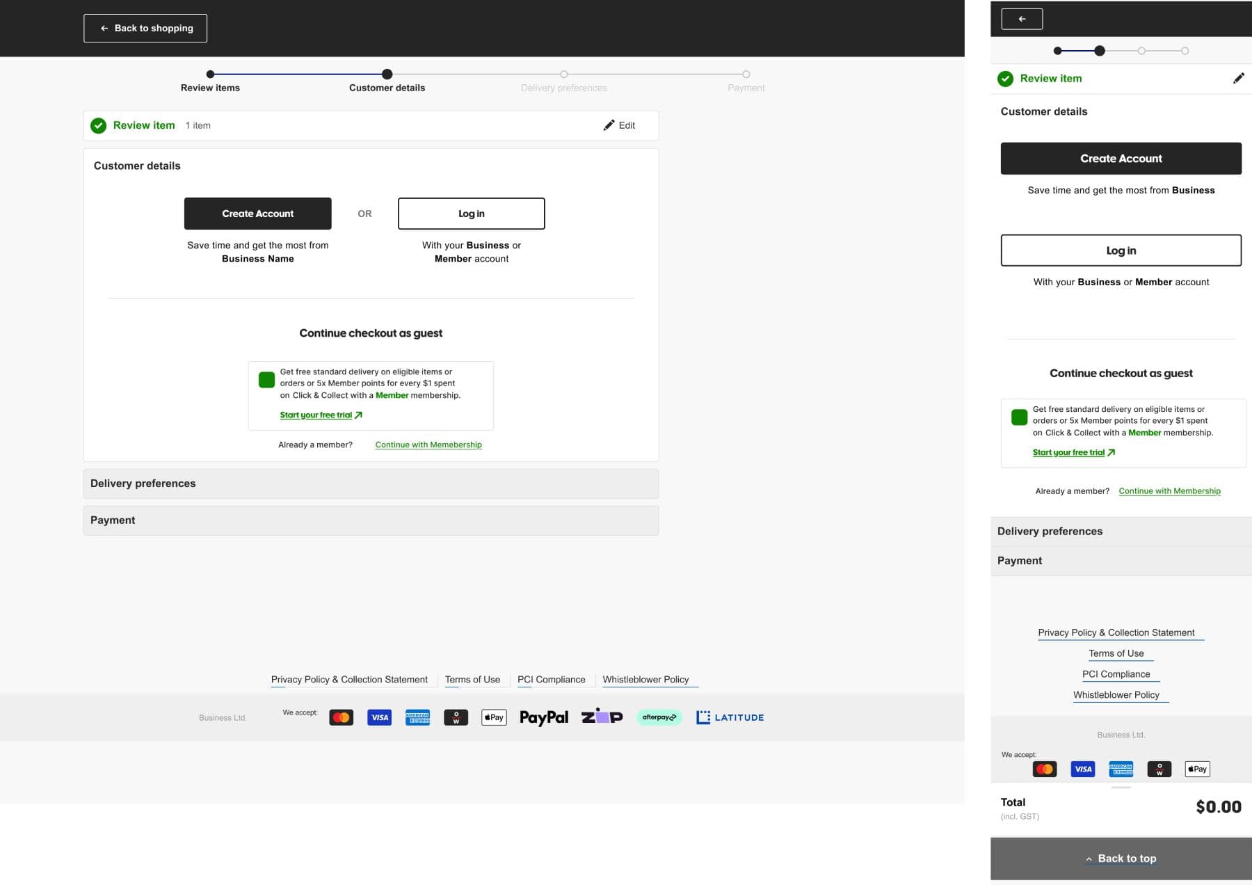
Shipped · Desktop customer-details stacked CTA layout, now live in production
Emphasising account/login within Customer Details will improve registration and login rates.
Neutral/negative
Acquisition intent softened · Iterate → CT-201
Side-by-Side CTAs with Value Cues
Side-by-side CTAs with value proof will improve login/registration intent without penalising continuation.
~30% relative ↑
Registration starts · Winner → CT-214
⭐
Desktop Stacked CTA Layout
A stacked CTA layout for desktop Customer Details will improve clarity and acquisition signals.
Shipped
Live in production
Removing irrelevant options for recently-known customers will reduce choice friction and improve login rates.
Positive
Login attempts ↑ · Adopted
Raising the primary Continue CTA above the fold will improve checkout continuation.
Neutral/negative
Familiar affordance disrupted · Iterate → CT-237
Prominence with Familiarity
Restoring familiar cues while maintaining CTA prominence will improve continuation without penalising completion.
Positive direction
Signals improved · Led to CT-243
Dead-Click Panel Simplification
Removing non-clickable panels that generated dead clicks will reduce confusion and clarify the path to Continue.
Rules adopted
Single CTA pattern codified
Persistent Sticky Continue (Mobile)
A persistent sticky Continue CTA on mobile will improve CTA visibility and checkout continuation.
Declined
Add-on behaviour ↓ · Contextual alternative recommended
Outcomes_006
The customer acquisition variant (stacked CTA layout) shipped to production and is now part of the live experience. The broader program was paused mid-2025 due to technical and stakeholder roadblocks.
Key Outcome
One variant shipped, the desktop 'Customer Log-In/ Create account' CTA layout is now live. Eight further experiments produced durable design rules and guardrails across guest/login, cart review, and mobile CTA streams; these are documented and ready for use to resume at a later date.
Reflection_007
This work is best framed as research, exploration, and learning. It identified what helps: guest-first clarity, value-cued login, familiarity at key decision points, and what harms: crowding mobile viewports, competing with upsell at the wrong moment. Equally, it surfaced limits that front-end tests cannot solve. The program pause was frustrating but honest, shipping one strong pattern and preserving the rest as design rules is a better outcome than forcing changes that the platform couldn't sustain. If I were to do it differently, I'd explore platform constraints earlier and build the test backlog around what's actually shippable, rather than discovering blockers mid-cycle.
