Overview_001
Acre Organics is an online grocery experience built around a simple idea: Australian-grown produce, delivered to your door in eco-friendly, reusable packaging. The challenge was designing a site that felt like a well-laid-out store online, one that makes quality and provenance visible while keeping the shopping journey fast and intuitive.
8m 53s
Avg. Task Completion
Problem_002
Shoppers want fresh, local produce and less packaging waste, but they also expect quick, intuitive journeys online. Existing grocery services were failing on quality transparency, sustainable packaging, and navigation clarity. The brief: design a grocery site that feels like a well-laid-out store, clarifies provenance, reduces packaging impact, and keeps journeys fast.
Pain Point 01
Poor quality transparency, shoppers couldn't verify freshness or provenance before purchasing.
Pain Point 02
Excessive, non-recyclable packaging with no return or reuse pathway offered.
Pain Point 03
Navigation wasn't store-like, category hierarchy was confusing, forcing heavy reliance on search.
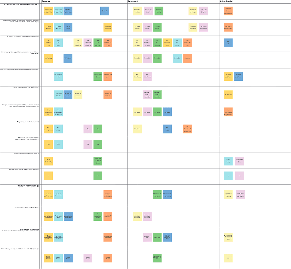
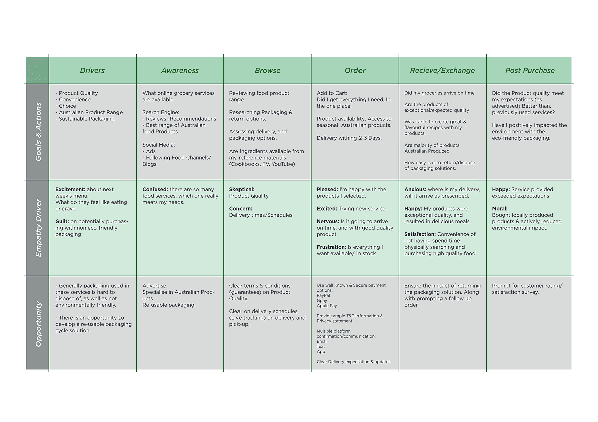
Research_003
Five qualitative interviews were conducted over two weeks exploring how food plays a role in participants' daily lives and the considerations they make when purchasing groceries physically and online. Two distinct user types emerged from the research, both placing high value on quality, Australian-grown products, and packaging accountability.

Research synthesis · Affinity mapping in Miro
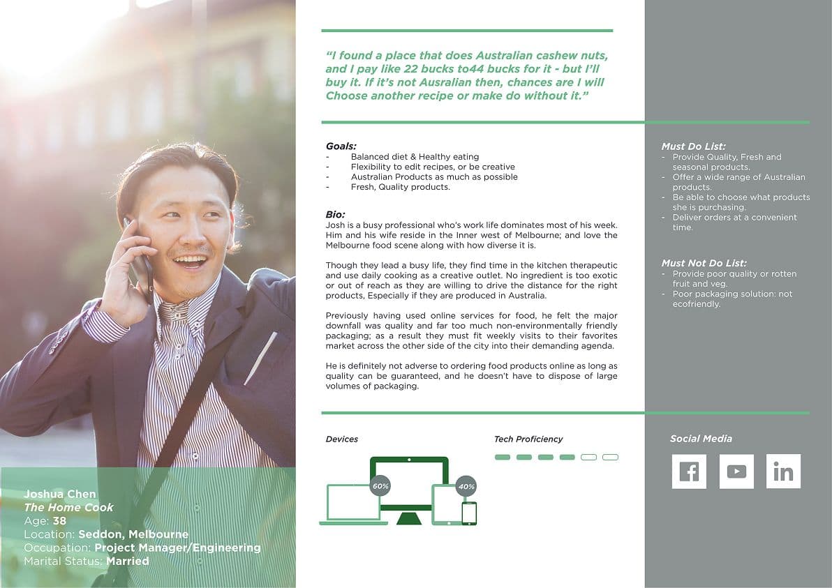
Joshua Chen
The Home Cook · Age 38 · Seddon
Values quality, provenance, and Australian-grown products above all. Willing to pay a premium and drive across the city for the right ingredients. Concerned about excess packaging but hasn't purchased groceries online due to quality concerns.
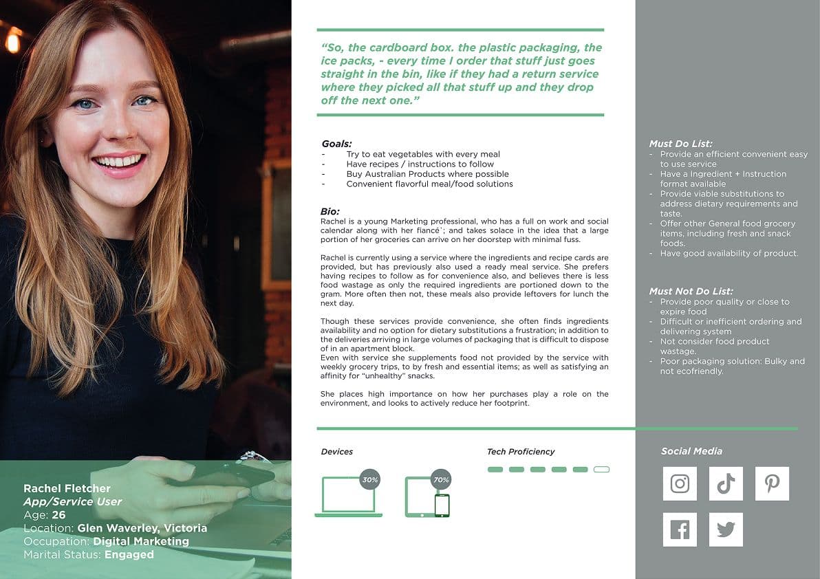
Rachel Fletcher
App/Service User · Age 26 · Glen Waverley
Currently uses meal kit services for convenience. Frustrated by bulky non-recyclable packaging, unavailable ingredients, and the lack of dietary substitutions. Actively tries to reduce her environmental footprint.
“"The cardboard box, the plastic packaging, the ice packs, every time I order, that stuff just goes straight in the bin. If they had a return service where they picked all that stuff up and dropped off the next one, I'd be happy."”
Rachel Fletcher · App/Service User Persona
Process_004
The process moved from research insights through information architecture, to lo-fi wireframes, usability testing, and a final iteration cycle, keeping store-like mental models central throughout. Each phase built directly on the last, with testing findings driving the most significant structural changes.
01
Information Architecture
Designed a store-like IA with clear category entry points, a recipes hub, and dedicated trust and returns content. Card sorting with participants validated taxonomy groupings and confirmed that supermarket-style department labels outperformed abstract category names.
02
Lo-Fi Wireframes
Built wireframes for Home, PLP, PDP, and Recipes, proving flow, establishing copy priorities, and surfacing sustainability cues at key decision points in the journey.
03
Usability Testing (n=5)
Five participants completed scripted tasks across five sessions, averaging 8m 53s. Navigation friction emerged clearly: 100% of users defaulted to predictive search over flyout menus, and 75% found flyout hierarchy confusing.
04
Iteration
Simplified flyout labels, added category landing pages with visual cues, and introduced 'Shop Again' and recently-viewed patterns to reduce search dependency for returning users.
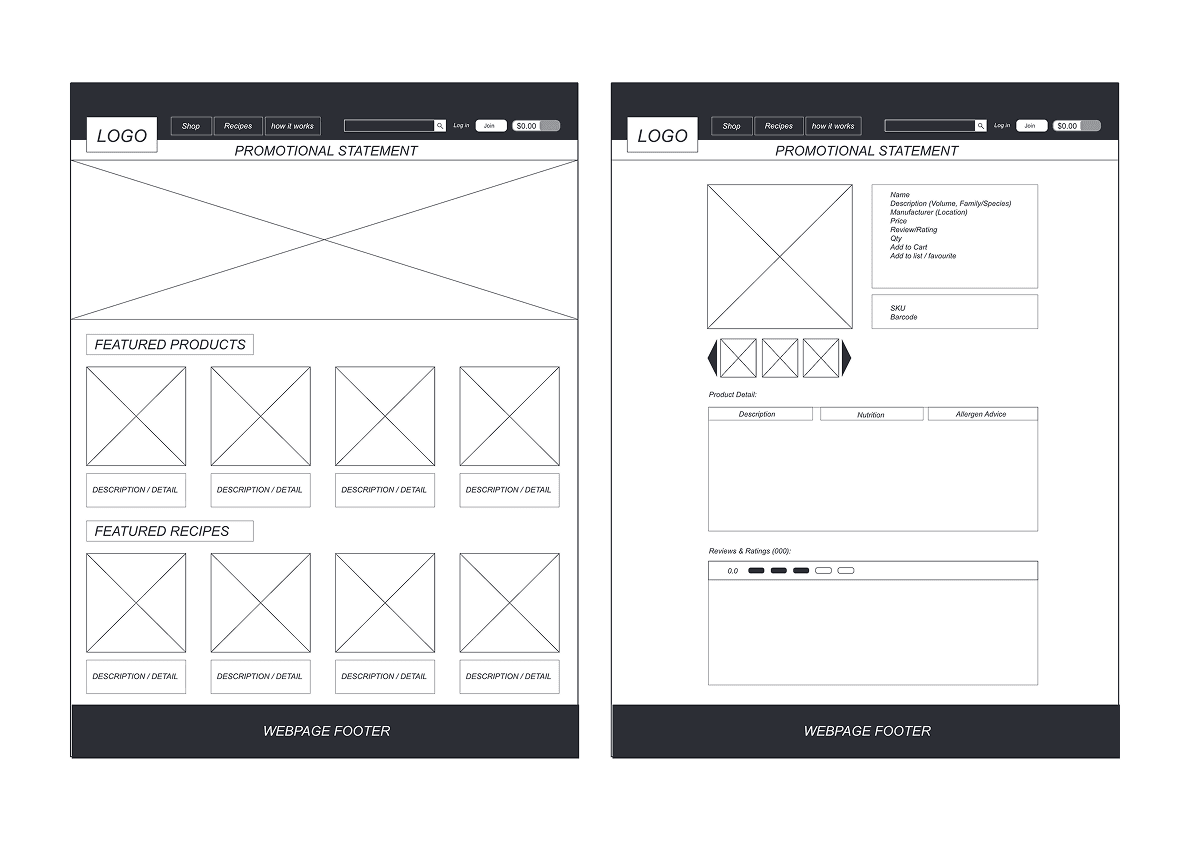
Lo-fi wireframes · Home, PDP, Recipes pages
Affinity map · Research synthesis
Customer journey map · Awareness → Post-purchase
Solution_005
The final solution brings together store-like navigation, strong product storytelling, and light-touch sustainability throughout the shopping journey, from homepage to checkout. Each surface has a clear job: orient, inform, and guide without overwhelming.
Homepage
Seasonal and local highlights, clear category entry tiles, prominent search, recipes rail, and a reusable packaging return explainer surfaced above the fold.
Product Listing (PLP)
Tighter filters, dietary, Australian-grown, packaging type, with a consistent card layout and simple grid/list toggle.
Product Detail (PDP)
Strong provenance storytelling, freshness and storage cues, recipe cross-links, and clear trust signals for delivery and quality guarantees.
Recipes & Sustainability
Browse recipes and auto-fill cart via "Shop this recipe." Packaging return program surfaced on PDP and at checkout, visible but unobtrusive.
Walkthrough of Acre organics prototype built for user testing
Outcomes_006
Testing led to a clearer, category-first navigation that reduces dependence on predictive search, while keeping quality and sustainability visible throughout the journey.
Key Outcome
A category-first IA with simplified flyouts and visual landing pages reduced navigation friction significantly. Store-like mental models, predictable labels, and light sustainability cues made the biggest difference to user confidence, not visual polish.
Reflection_007
Grocery UX benefits most from store-like mental models online. IA clarity, predictable labels, and light-touch sustainability cues made the biggest difference, not visual polish. If I had another sprint, I'd run tree-tests on menu labels and a small card sort on the recipes taxonomy to harden findability before moving to high-fidelity design.
“"Grocery shoppers expect to navigate the way they navigate a physical store. The moment that mental model breaks, when they can't find the aisle, they default to asking someone. Online, that's the search bar."”
Montague Joachim · Reflection
